The Collaborative Art Commission Projects section is a detailed sampling of the artisans hired to work with John as he designed individual customized pieces to meet the Penthouse's aesthetic objectives. Each artist's previous creations were utilized as inspirations from which to collaborate on new masterpieces. John visited most of these craftsmen in their studios, and was intimately involved in not only the basic design elements, but also materials selection, progress reviews and installation coordination. The first photo is the final completed commissioned piece. Additional images include in progress pictures, design suggestions and instructions, initial renderings, material choices and correspondence. Each section also includes a brief review of John's participation, influence and objective throughout the creative development with the artist.
FLICKINGER GLASSWORKS | info@fgw-ny.com | Flickinger Glassworks - www.flickingerglassworks.com | Red Hook, Brooklyn, NY
Click to view the Dinnerware Collections | Click to view the August 2015 Press Release
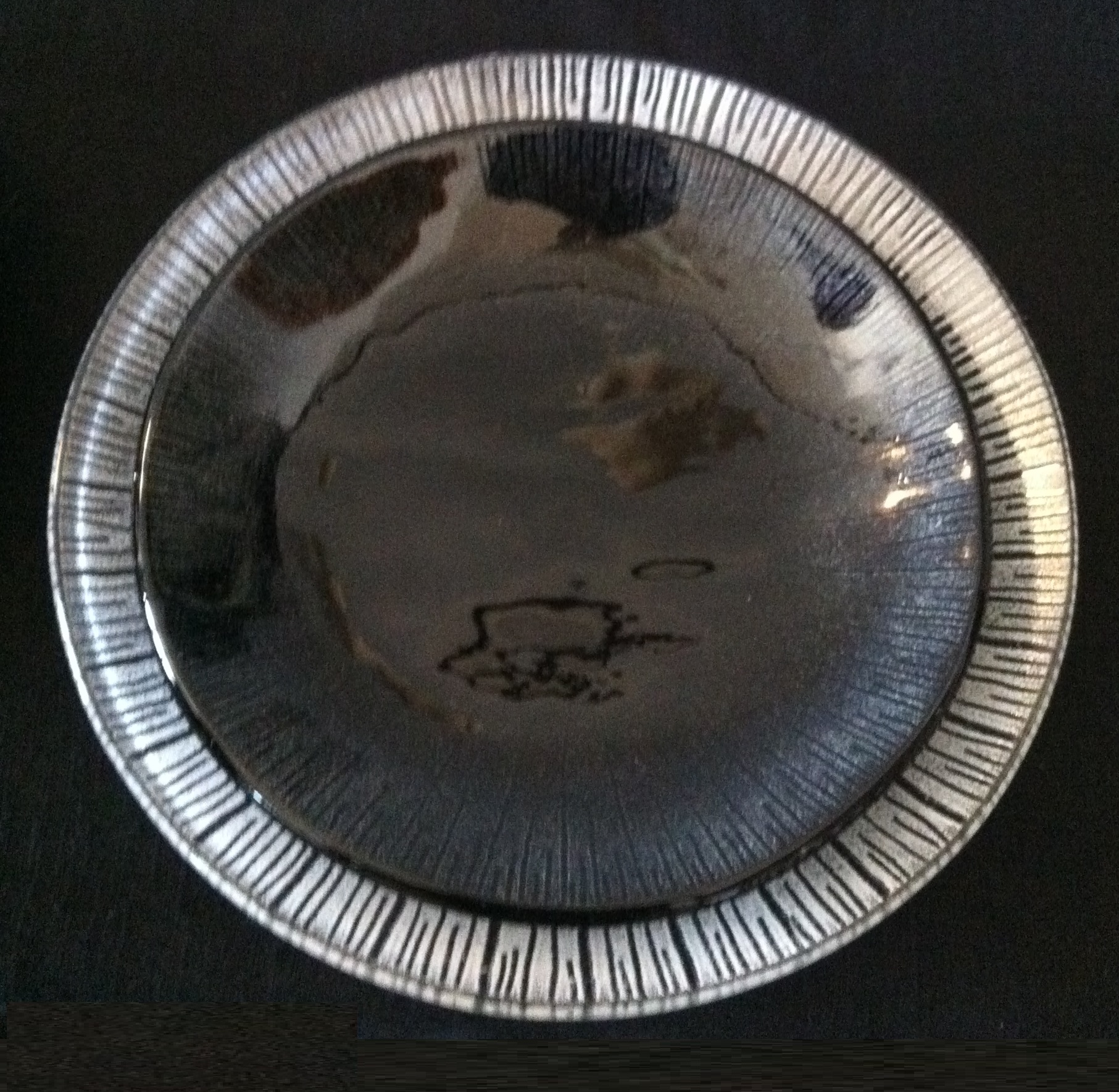
The sequence of meeting Charles Flickinger is a story of stumbling into a goldmine when you have given up hope of finding a design solution. I certainly had no original intention of designing and manufacturing my own dining room tableware for this project. The plan was to research existing options available for purchase, consistent with the sophisticated Contemporary Abstract styling of the overall Penthouse design. Unlike traditional patterns, the Contemporary options were so limited and stereotypical that I felt I had no choice but to produce my own custom line.
The only designer who specialized in this field seemed to be Elizabeth Lam, known to design tableware for many of the leading chefs and fine dining restaurants around the country. I traveled to Brooklyn to her studio and learned that her minimum quantity of 150 for a custom design, would not work for a private residence. Dejected and out of leads, my assistant and I decided to walk to Red Hook Winery and drown our sorrows. Along the way we saw the Flickinger Glassworks Studio and stopped in to explore....Jackpot!!
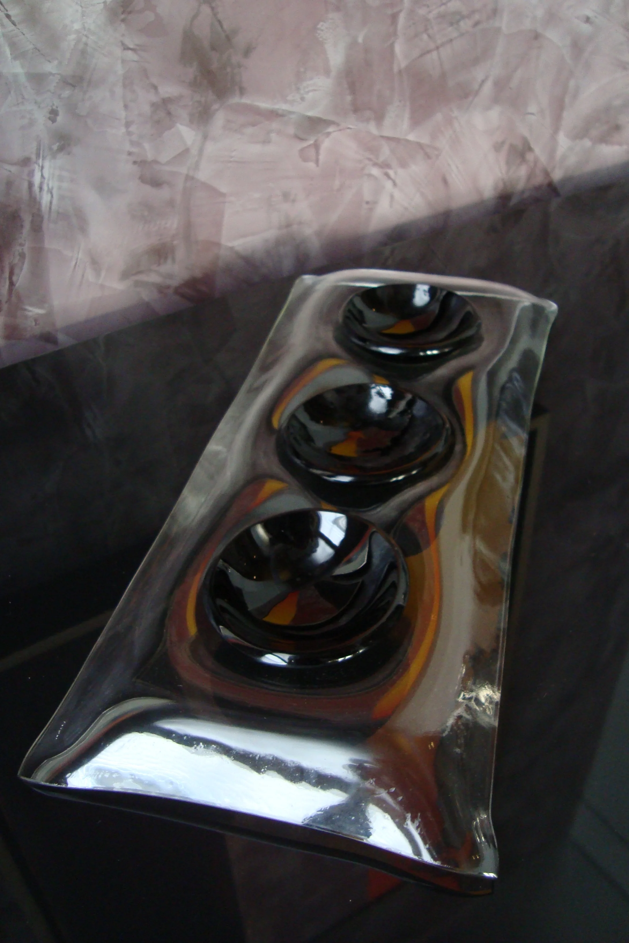
Charles runs an industrial glass bending shop using period materials, but was looking to return to more creative glass designs as he entered semi-retirement. I explained my general vision and he signed on. As you can see from the pictures, we started from scratch on glass type, forms, scale, etc. We ultimately chose Russian Black glass that is dense and wavy, and an enamel color that coordinated with the related Dining Room tones. I went with circular plates to flow with the circular dining table instead of the usual square or rectangular shapes that are currently available in Contemporary collections. The bowls are transparent in order to expand the viewers eye through the served food, as well as the beautifully decorated table. The enameling gradually flows from the outer rim towards the inner center of each bowl before disappearing.
Charles and his staff created a collection that surpassed my expectations; the collaborative process with him was equal to every designer's dream partnership. Besides being a terrific craftsman, Charles is one of the finest gentleman that I have worked with throughout my career. During our project, Hurricane Sandy unleashed her fury on the eastern seaboard. Charles' sizable workshop was wiped out. With the grit and spirit of a New Yorker, he not only rebuilt his shop in record time, he updated its technology capabilities securing a bright future for the business. When a business owner goes online to ask his friends and clients to help offset the substantial costs of this catastrophic event and he's welcomed with immediate and overwhelming support, you know he has treated many, many people generously throughout his career and life.
This particular product development opened what I think is a tremendous business opportunity for Charles and Flickinger Glassworks to capture an untapped market. I did some market analysis which confirmed my instinct and encouraged him to move forward. In August of 2015, Charles and his new lead designer heading up this business line, launched an initial collection of six Contemporary place settings at the Jacob Javits Center along with an invitation for designers to custom create their own tableware. Continued good luck to Charles and his dedicated team of artisans.
JAY KELLY | www.jaykelly.com | jay@jaykellyart.com | Jim Kempner Fine Art - www.jimkempnerfineart.com | New York, NY
I originally found Jay's work in Chicago and inquired if he did commissioned pieces or worked in a larger scale than the 6-8 inch pieces displayed. To date, he did not. After another year of searching for similar sculptures that combined multiple mixed media materials with his unique shapes, I eventually tracked him down at his primary dealer gallery in NYC. After some gentle urging they agreed to set up a meeting to discuss the Penthouse design project, but informed me he had turned down previous commission opportunities. Once we met and Jay understood my vision and how his work would be displayed, he agreed to sign on with some requirements. Initial design direction could be provided but no progress pictures or discussions would be held. Once the piece was completed I would have the first option to purchase it at a preset agreed price. If I declined it would go to the gallery and he would continue this process until I was satisfied. The piece you see here is his first ever commissioned sculpture, and at a larger scale than his previous works. Jay does not name his pieces, but numbers them sequentially. This is Untitled #278. It is now prominently displayed in the Foyer niche near two additional smaller pieces that are on each side of the foyer console. I've met Jay in NYC socially a number of times and he has become a friend. I respect his creative vision and detailed craftsmanship and feel honored to have collaborated with him as he expanded his horizons. Jay now works in even larger forms and I continue to be impressed with his new creations. The future will only continue to keep him in demand.
ROM LAMMAR | www.lammart.lu | lammart@pt.lu | Rive Gauche - www.rivegauchegalleries.com | Luxembourg - Europe
It was quite a miracle to stumble across this fine young artist from across the pond. Who knows how this introduction would have occurred if not for the internet. I have not had the pleasure of meeting Rom, but his commitment to excellence and client satisfaction is second to none. I was initially attracted to a number of his pieces but Dance of the Elements 2 in particular. Sometimes you get a gut feeling about an artist and this time it hit big. I asked him to alter the shaping of his primary structure to not appear to resemble a religious cross, to which he gladly obliged and immediately created a form with which I was thrilled. After sending him a sample of the accompanying wall Perlata finish that he was going to work from on the outer edges, he went to work on blending his mixed media painting into a favorite. He forwarded progress pictures periodically and it was like watching a birth. You will see from the pictures that I asked him to ease the transition from the darker richer outer areas gradually into the piece with less contrasting white and lighter color. As he did, the piece literally began to breath. This painting, Essential Element, hangs in the Master Suite and is consistently admired by each guest. Rom is truly an artist to follow as he continues evolving.
LUSIVE DECOR | www.lusivedecor.com | LDsales@lusivedecor.com | Los Angeles, CA
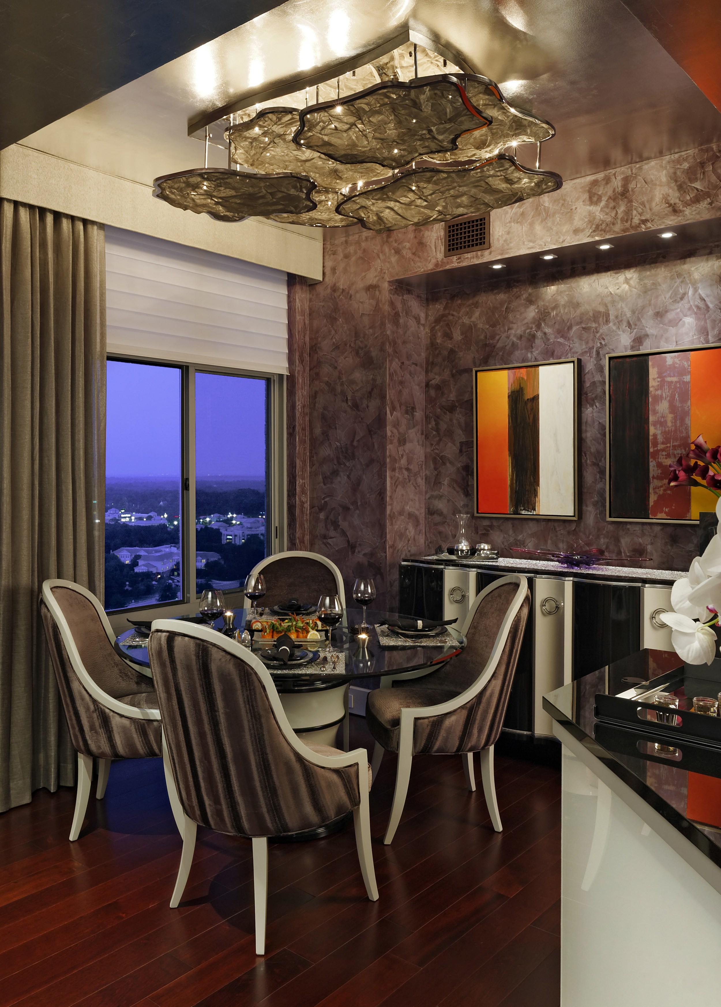
The Penthouse Dining Room created a design challenge in that the placement of the dining table would not be directly centered under the room's ceiling soffits and therefore, any hanging lighting piece would not be centered over the table. I decided that any hanging lighting in that area would also be problematic visually because of the sight lines to the installed art works. A decision was made to keep the lighting at or above the bottom of the soffits, and to create a fixture that was multi layers and filled a significant amount of the inner soffit area to eliminate any visual centering in relation to the table's placement. I accomplished this by bringing the clouds from the outside skies into the space. Lusive was selected based on their ability to create custom lighting fixtures per a designer's visual objective, while offering practical solutions as to the engineering specifications required. We sampled a variety of different metal mesh materials under an array of lighting scenarios before we made our final selections. The goal was to have the LED lights hidden above shine through 3-dimensional hand shaped clouds; stars would appear where the LEDs were located. The ceiling surface was finished in hand applied silver leaf to highlight the reflection and create a special and unique atmosphere to dine in eloquence. This fixture, as all other lighting in the Penthouse, is dim-able providing the user a wide range of intensity to illuminate depending on the desired mood and vibe.
LYLE LONDON | Art In Metal - www.artinmetalusa.com | Tempe, AZ
I found Lyle's work online and quickly became a fan. I love his clean lines and ability to have our eyes see contours that gradually lead us smoothly over each surface area. Lyle works on both interior and exterior sculptures. The first piece I commissioned was an interior piece, Undulating Column, that we re-sized to proportionally fit a niche area to the right of the Living Room fireplace. The four sided alternating height gives this piece an optical flow, driving our eye vertically. This defines the ending of a wall length, horizontal Cherry wood paneling with metal reveals that connect to the horizontal Delano Marble fireplace. The gorgeous, sleek vertically driven sculpture completes this wall, creating a clean and definitively pleasing visual anchor of this space.
The second piece I selected some months later was actually an extremely tall outdoor piece that was also done in wire mesh. I was mesmerized by the sexy curves and imagination of what the artist envisioned when he imagined her posing. I decided after many renditions between a combination of solid and mesh to go with an all solid stainless steel material. Ultimately, the continuity and simplicity of the design objective and the coordination with his other piece made the decision quite easy. Again this piece was scaled to perfection using the measurements of the above soffit height and the sculpture to base pedestal ratio that visually maximized the viewer’s eye. This calculation included angles from the Kitchen while standing, seated in the Dining Room, along with the sitting positions in the Lounge and Living Room areas. This particular placement has the greatest visual spread within this Penthouse and the scale needed to be perfect from every vantage point. I also enlisted the millwork craftsman who was tasked with all the Cherry wood throughout the space. We designed a base using the exact curved inverse from wide to narrow that was designed for the Foyer and Living Room consoles. The visual connection demands that not only the material, finish and style were duplicated, but also the optical comfort that each angle and curve was symmetrically inverted. I had this sculpture, Oracle 11, facing the adjoining Lyle London piece at the far corner at a precise geometric straight line to drive a linear line across the length of the spacious living area. The base to this sculpture is highlighted and pictured in this section under RKI.
RKI | Woodbine, MD
RKI is owned by Henry Kawa and represents the finest millwork craftsman that any designer could be blessed with for collaboration. Henry's work is displayed in every room throughout the Penthouse, clearly illustrating the definition of a perfectionist. Each console, wall paneling, floating shelf or bed, sculpture base, wire suspension wine rack, etc, was meticulously crafted and installed to razor sharp precision. Henry and his crew are not only skilled with their hands, but their visual creativity and problem solving minds allowed me to design without limitation. The sculpture base pictured was designed near the end of the project when we could determine what scale the base and sculpture would need to be in order to balance all the surrounding elements. RKI and I coordinated directly with the sculptor, Lyle London, to perfect this equation. The result was a base that continued the Cherry wood paneling and metal reveals from the Foyer and Living Room into the Dining area. The curved base is the exact inverse of the Foyer and the Living Room consoles, allowing the eye to easily align this piece with the others. The top was proportioned to perfectly fit the sculpture and complete the presentation. The result is an artistic statement that can be enjoyed from four Penthouse areas with equal impact.
When I first viewed the Penthouse Kitchen with respect to the overall design direction and visual targets, I knew a major element needed to be adjusted in this area. I decided to abandon the practicality of the pantry and create a more visually appealing functional illuminated wine rack. Even though I had not seen anything like what I was envisioning, I remembered that some Las Vegas restaurants had installed elaborate wine displays. So, I felt it could be accomplished. The LED wall lighting under the Kitchen counter facing the Dining Room was the design inspiration to build an entire back wall LED system behind the wine rack. Dialing in any color through remotes to these LED wall areas would help create a one-of-a-kind lighting experience. The reflections off the back splashes, sculpture, etc is a truly visual completion of the design objectives. In order for the LED wine rack lights to shine through, a traditional boxed structure would not suffice. I then came upon the concept of a suspension bridge and contemplated a criss cross wiring pattern to hold the bottles. Incredible concept, but with all the weight of the almost 100 bottles, it would require some ingenious engineering to pull it off. RKI to the rescue. Henry was able to bring this vision to LED life and now the Kitchen has been totally altered. The room became longer visually in depth with your eye now drawn towards the wine rack and away from the appliances. This design also provided the space to present and store wine for the convenience of entertaining. Just as you cross the Golden Gate to get to Napa, this Penthouse has its own suspended gateway to fine wine.
GRAHAM CALDWELL | www.grahamcaldwell.com | graham_caldwell@hotmail.com | Navy Pier, Brooklyn, NY
Graham is originally from Washington D.C. where I was living when I saw his work displayed locally. He had left for NYC a few years earlier and was flourishing as a glass and metal fabricator. I made an appointment, visited his studio in Brooklyn and we immediately formed an intuitive artist connection. Graham is a super chill cat who has an extraordinary visual range. A range beyond where my design sensibilities can venture at times, but it's a treat to share space with a young already established super star. I was originally attracted to a glass and Spatter piece he had done for a European based embassy for the U.S. State Department. That piece was much larger so we scaled it down to fit the Foyer entrance wall as you entered. Due to its potential fragile condition at that location, I designed a 4 inch taper-edged niche to artificially frame the piece as well as receding it from the walk traffic. A Cherry tapered console was also installed both as a functional and visually attractive beginning to the Cherry millwork that tracks throughout the Penthouse. I provided Graham with fabric swatches and wall samples and we then customized the color of the hand blown glass, ultimately attached by metal to the wall individually. Obviously these types of works installed by the artisan, provide time to groove to some new found reggae. The Foyer wall opposite this piece is completely mirrored which only enhances the 3-dimensional impact of Graham's Spatter.
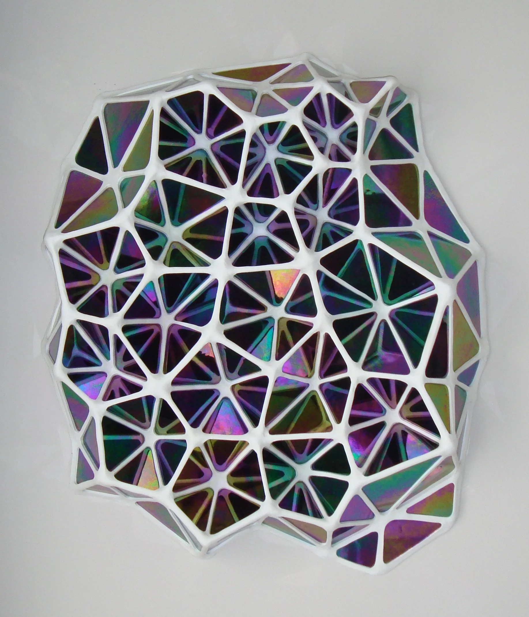
The second piece I commissioned was done quite a bit later due to the fact that all the furniture needed to be in place so I could see first-hand how to deal with the wall in the Lounge above the deceivingly tall and steeply sloped over-sized accent chair. Placing a square or rectangular piece of art there would directly conflict with the chair, and leaving the wall bare would be a visual hole due to its placement from entering the living space from either the Kitchen or Living Room hallway. I critically decided to postpone attempting to figure this out in advance and avoid what could have been an eye sore. Once the Penthouse was fully decorated, it became obvious this was not going to be easy. I needed not only a unique shape but something 3-dimensional. It also had to be a material that was not foreign to the objects already in place. The answer appeared when I was in NYC working with Brooklyn area glass sculptor, Charles Flickinger. As I chatted with Graham he showed me a small sample (pictured) of a new series he was experimenting with. Boom....the lightbulb went on and we created a design utilizing his new glass construction. We were off and running. I forwarded the wall dimensions to Graham and we scaled the piece, Polychromatic Formation #4, to fit the unusually difficult wall. It is most rewarding when you are patient as a designer and get lucky when an answer is in the hands of a creative mind.
GREGORY HAWTHORNE | art@hawthornegallery.com | Hawthorne Gallery - www.hawthornegallery.com | Big Sur, CA
The Hawthorne Gallery is situated over the ocean-side cliffs in Big Sur, California. This family owned business has multiple generations of artistic Hawthornes who create a range of items from jewelry and paintings to iron sculptures. I was staying at the nearby Post Ranch Inn when I first met Greg Hawthorne, who specializes in metal fabrication of furniture and sculptures. His work adorns the Inn which is the ultimate backdrop to his masterpieces. I commissioned him to assist me in the design of an outdoor stand-up table and chairs.
We worked from an existing chair design of his but inverted the curved legs and then customized the seat backs and the table base legs to coordinate with the Penthouses visual focus. The table top was separately commissioned with an affiliate gallery artist, Michael Gustavson. The finished set is located on a small balcony that divides the Living Room from the Lounge area and is directly in sight line of the large John DiPaolo painting centered in the Penthouse.
MICHAEL GUSTAVSON | www.gustavsonstudios.com | Hawthorne Gallery - www.hawthornegallery.com | San Jose, CA
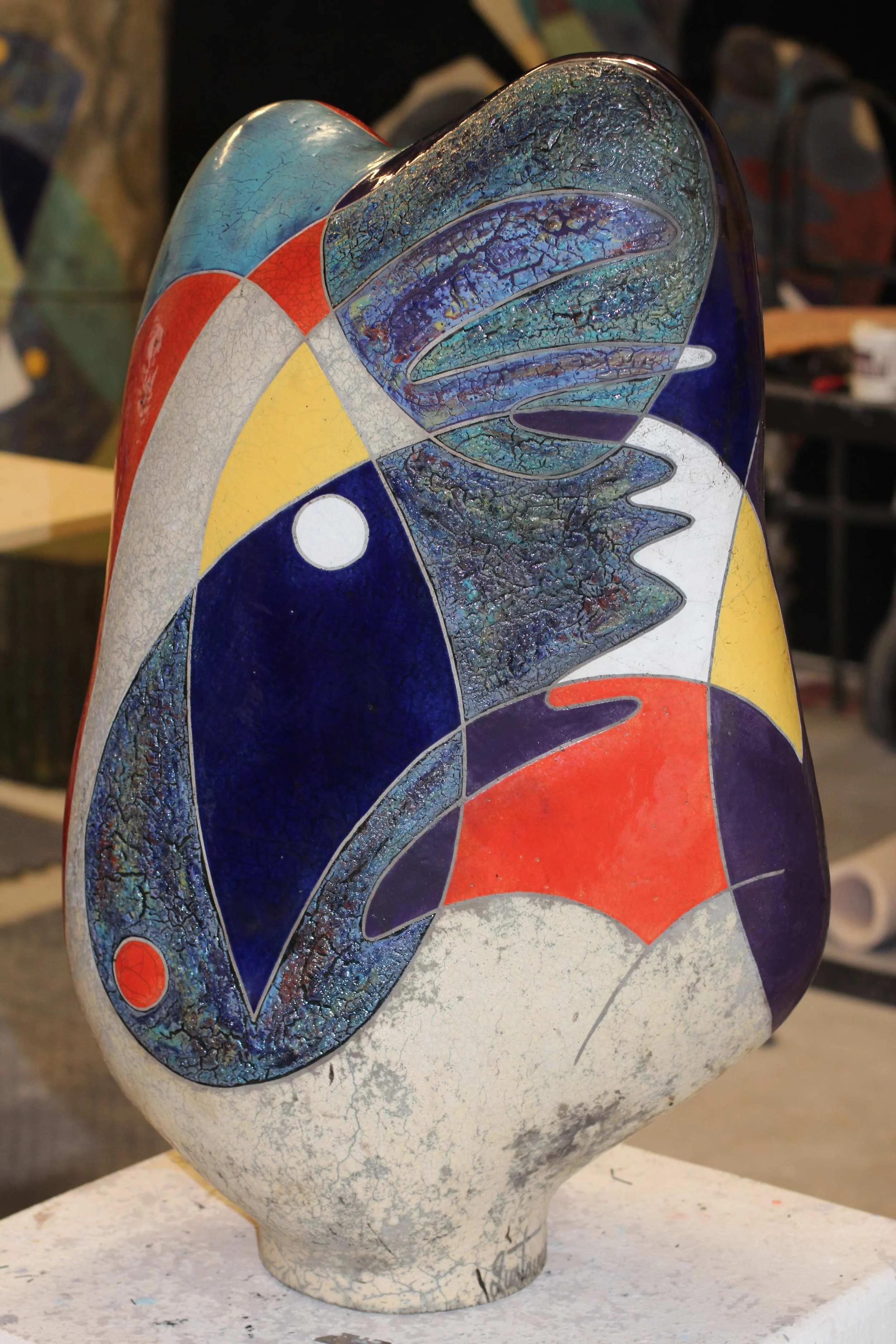
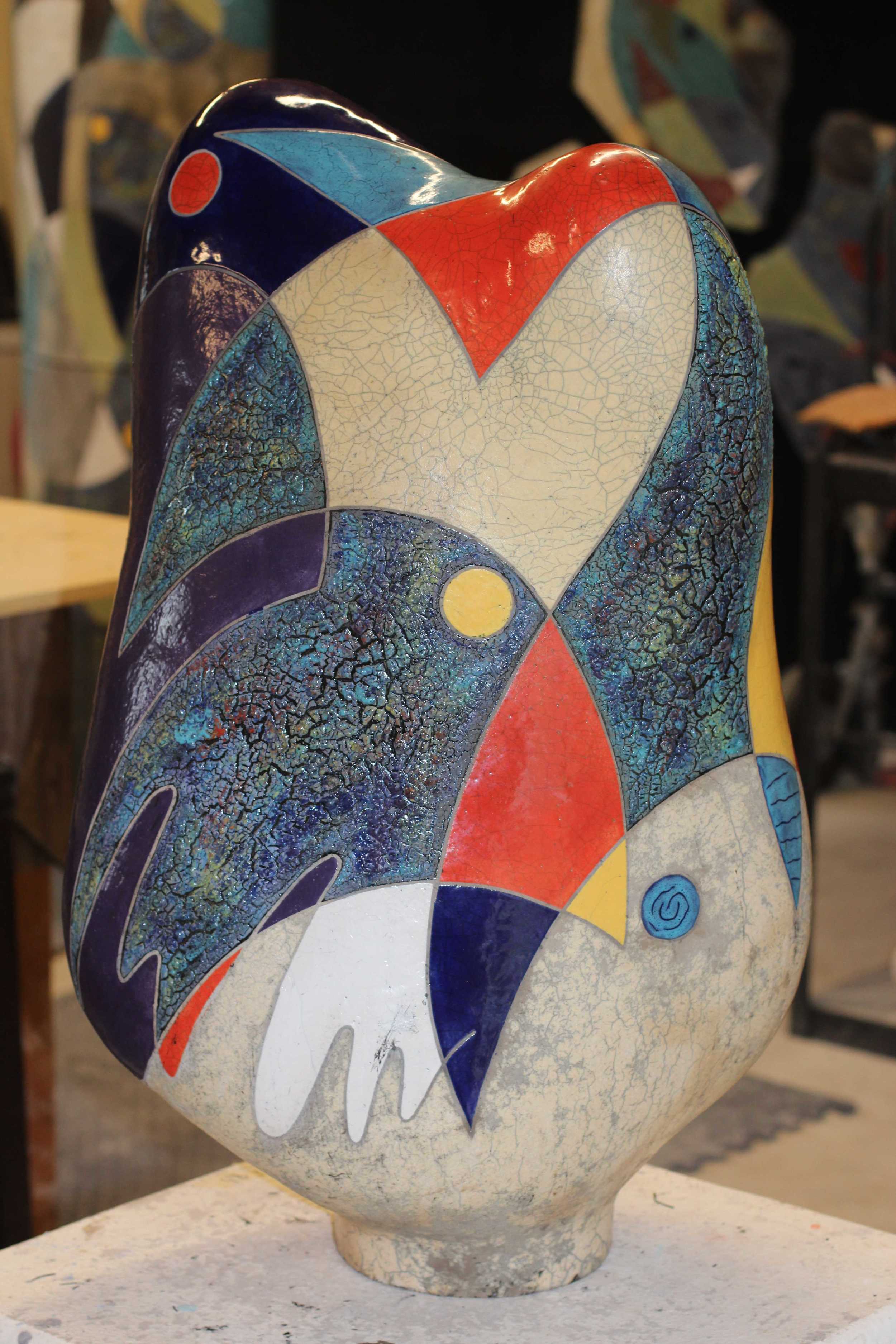
Michael Gustavson is represented by the Hawthorne Gallery in Big Sur, California, with his ceramic sculpture studio located in San Jose. Michael's work is incorporated into wall pieces, table tops and sculptures that are designed for both interior and exterior locations. I selected him to complete the Greg Hawthorne patio set because of his Picasso like line work and the colorful and energetic coloring that he utilizes. A raku pottery finish has always been a favorite, and the table tops that he produces are spectacular when seen under a sunny sky. I forwarded various color samples of the interior that we used as our pallet to fill in the pre-drawn table top template. As you can see in the pictures, the vibrancy created will bring an early morning breakfast or coffee to life as we begin our day.
After I commissioned Michael to design the above balcony table top and it was under way, I decided to add an additional matching outdoor floor sculpture. This piece was scaled based on its balcony location, centered in the glass window to the left of the balcony door. The base was created by Greg Hawthorne in brushed aluminum and designed to secure the sculpture on the windy balcony. The sculpture's shape was designed with Michael working from a couple of his previous works. I preferred a more upright and vertical direction that fit the window's proportions and kept the table top's similar flowing line concept with the adaption of the circular 3-dimensional impact that a sculpture can bring to life. I think the distinction between the flat table top surface where the lines have a finite end versus the non-stop rotation of the sculptures lines, allows the viewer to see his creations at the same time in both dimensions. This combination reinforces the enjoyment of being able to view these similar pieces simultaneously.
MICHAEL ENN SIRVET | www.sirvet.com | info@sirvet.com | Washington, D.C.
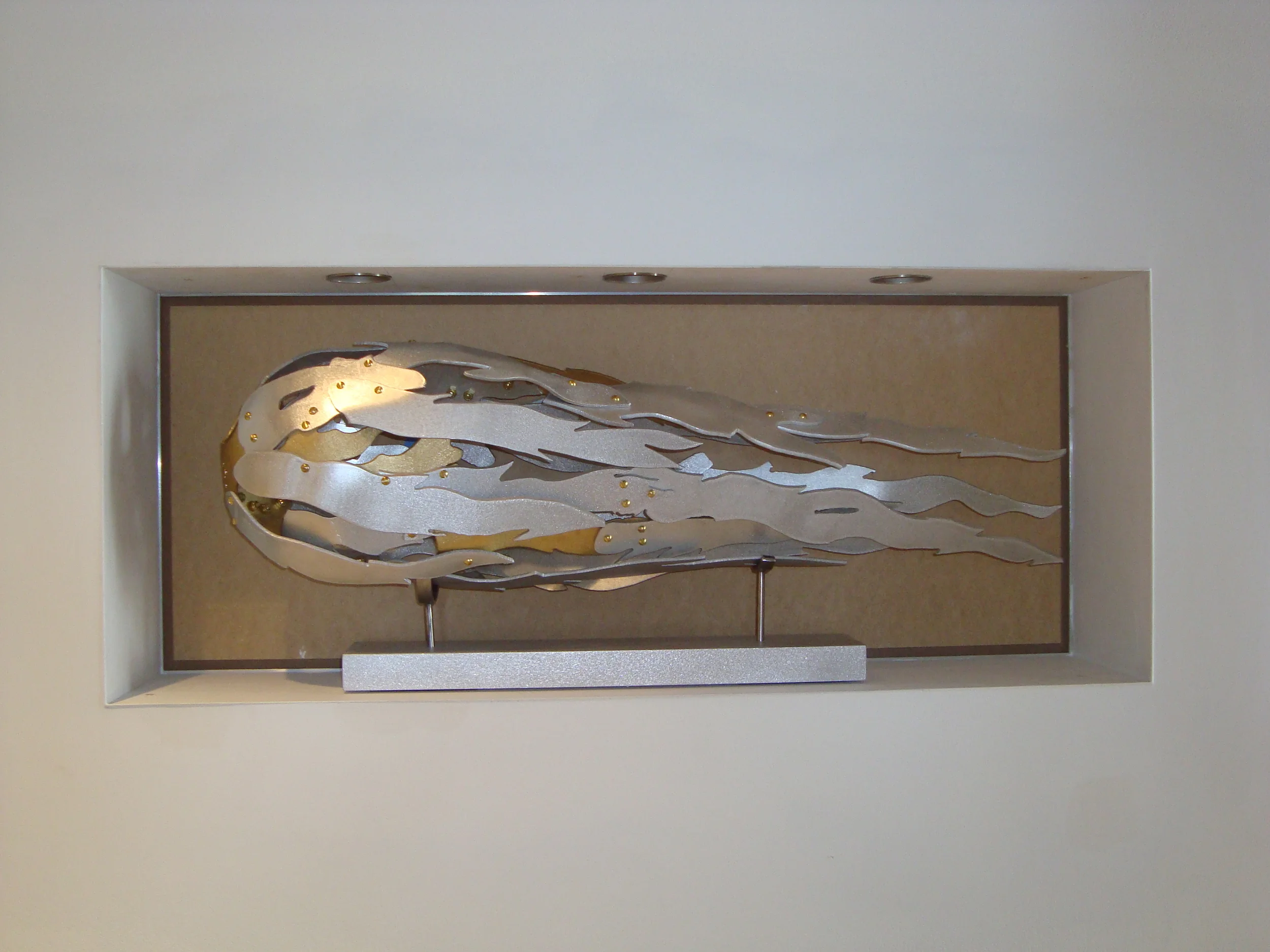
I was wandering around Georgetown one afternoon and came across a gallery that carried large scale, unusual artistic furniture. Michael’s work was prominently presented and I was drawn to this heavy looking polished metal with perfectly cut holes throughout it. I had no idea how I could use his talent but I definitely needed to research him. I guess it is a good start that Michael Jordan commissioned him to make a dining room table using the material and process that attracted me. The gallery arranged a meeting and Michael was a rare find. Being severely dyslexic myself with a strong analytical mind, it is unusual to come across an equally competing creative mind within the same head. He is a structural engineer by education and profession before venturing into artistic design. Due to his background, he is able to build items with incredible strength with minimal visual structural support. By applying the most current technologically advanced machinery that utilizes high powered water cutting through metals, he pushes the limit of your imagination. We started with an art piece that is located in the Foyer niche, titled Orbit Meteor. I was looking for a metal type of sculpture that did not sit quietly but challenged you to feel it's strength and more importantly, it's mobility and speed. This work represents to me the dense yet open movement of a comet or an object whizzing through the Galaxy, which just happens to be at rest in this quite little niche. Maybe after a few cocktails a guest could be lifted off and enter a world of which our minds can only dream.
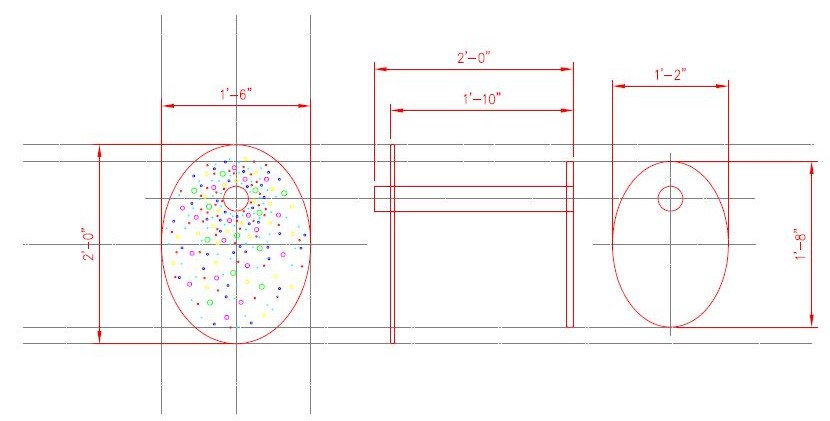
Now back to the practicality of design and another challenge in the lounge area. The sofa has an ottoman with a sliding oak wooden top to rest glasses, etc. The over-sized accent chair needs a side table of some type but nothing chunky that visually takes away from the chair, hides the exquisite rug or blocks the view out the window when seated on the sofa. Michael Sirvet to the rescue. Who could make a sleek durable side table with minimal density. I got to utilize the randomly drilled round holes that first attracted me to his work. The table scale was derived by the sitting height in the chair and circumference that was proportional to the ottoman. We got to powder coat it to play off the rug and a winner was found in Circular Side #1.
OMAR CHACON | Fouladi Projects - www.fouladiprojects.com | San Francisco, CA
Finding Omar and his work was as intriguing as his spectacular creations. Having attended Art Basil in Miami for years before it became in vogue, I periodically met intriguing artists and sometimes I would meet intriguing people, and Omar fills both of these. I stumbled across his work one year while I was purchasing another piece from an artist who was represented by the same gallery owners who represented Omar. As I spent time closing our transaction, the gallery owners answered a few questions for me about Omar's background and work. He wasn't there personally, but I was fascinated by his creations and took note. When I am impressed with an artist's work but cannot currently find an opportunity to utilize their talent, I will safely stash the information away for a rainy day. The following year, I tracked down the gallery owners and they invited me to meet Omar during Basil. We met during the afternoon and before you knew it we were at dinner brainstorming ideas. I found the perfect location to present his work. I was drawn to his pieces that rest on horizontal surfaces, however it's tricky pinpointing a surface area that will properly display works covering surfaces horizontally and also look spatially pleasing. His deep layering, vivid coloring and overlap creates an extremely attractive sight from both on top and from the side, where the dripping impact is a statement. When you dial into this style of art and how to view it, I concluded it would give you maximum visual impact if it was slightly below your eye level but also placed where you would be relatively stationary. The solution would need to be at or near a sitting area. But it's a tough piece to coordinate into a traditional coffee table, too large for an accent table and too wide for a console or bookshelf. Designing this office where floating LED shelves are filled with various types of art, the desk top under a row of shelving would give the viewer seated at the desk a perfect angle to enjoy both the circular never ending acrylic colorful layers on top but also, you would get to feel the natural movement as it spills over the edges and rests onto the gorgeous desk finish. It is an awesome high when you can commission an artist like Omar and find the perfect home for his new creation. We worked on the color pallet of the piece along with the size and composition of the acrylic circles and especially the flowing excess onto the desk. As Omar would attest, I felt compelled to add a few extra purples in towards the end because you can never have enough purple....at least when you're inspired at Basil with a few cocktails and Omar throwing one liners out that stop traffic. The only thing more interesting than great art is passionate artists. Omar delivers both while he keeps everyone smiling :)
















Located in the Dining Room